Truth Table Generator

I originally created this tool in 2002 – yes, 2002. I was recently going through my old work and thought it might be fun to put up. I refreshed it a little (to use Bootstrap and jQuery) and made the code a little cleaner, and put up online again.


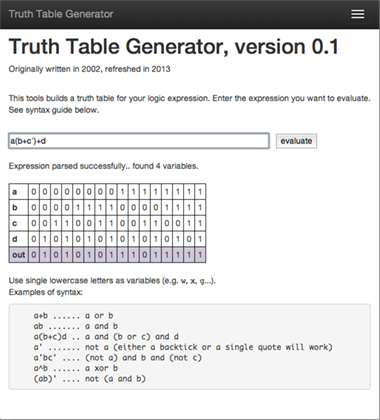
Truth Table Generator is a very simple tool. It allows you to enter a logic expression (using the shorthand notation, i.e. + for OR, nothing for AND, quote or apostrophe for NOT) for which it will show you a truth table, displaying the result of the expression for each of the possible set of values of the variables. It works for up to 26 variables, though it (obviously) gets very slow for 12+ variables – and, anyway, I would say that the value of a truth table is seriously diminished if more than 6 variables are used...


It's all client-side (which makes it fast, and allows it to work offline), which is a common thing these days but in 2002 it was sort of a new thing.

Click through to use the tool.

Click through to use the tool.


References

Crowdsourced Art

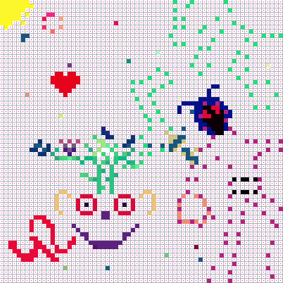
I had this idea to get my friends together to create art. I created a simple tool which allowed them to draw on a small canvas. I gave them a small number of pixels each, but they could cooperate (and earn bonus pixels) or overwrite others' work.

I ran a small iteration of this project back in 2009 with my friends. People had fun so I decided to add a few new features. Currently, the tool has an ability to "mine" tokens directly on the page - with enough patience, you can earn free pixels just by staying on the page. I'm also trying to make it a little easier to draw and explore what others have done.

I hope to be done in a couple of weeks, at which point I'll give all my classmates a chance to contribute with a relatively large number of pixels each. In the meantime, you can play with the test run, by mining the pixels (you can also email me to get a token). The canvas so far is shown below. Click through to contribute!


This is the canvas of the current crowdsourcing art experiment.

To get all the details, you can read about this project here.

By the way, in the 2009 iteration, my friends came up with this:


This is the result of the 2009 iteration of the project.

The Actual Boston Subway Map

(Originally published August 3, 2010, a lazy many years after the author actually created the map)

Being a son of a seafarer, I developed a kind of fascination with being on the sea, and with maps. It is because of the latter (and because I happened to live in Boston, and because I didn’t quite like how MBTA imitated Harry Beck, and because I always wanted to know how far it actually is between the different subway stops) that in 2005 I decided to make an actual Boston subway map, that is, a geographically-accurate map of all subway stops.

It was several years ago — I believe MBTA may have added a few subway stops since then, and you can also see all these stops on Google Maps, but there’s something elegant in the simplicity of my diagram. It’s also a good case study of Google Maps, scripting and LaTeX.

The idea was to find all the subway stops on a map downloaded from Google Maps using the locations of the stops as reported by MBTA (as you can imagine, it was a humongous pain to click on every single station map to figure out where to actually plot each station), and put the coordinates of each station in a LaTeX file that would generate the pdf image of the subway map. I used pstricks, which is a great LaTeX package for drawing graphics.

I wrote a tcsh script downloads the relevant quadrants from Google Maps and creates an HTML file that displays all the quadrants on one large page (you can download the script below).

Then I opened the large map in Photoshop and figured out the coordinates of each subway station and turned them into a LaTeX file. Finally, I ran LaTeX to generate the following image file:

The actual MBTA map (pdf).

The actual MBTA map (pdf).

Sources

The tcsh file that downloads the relevant quadrants from Google Maps (the URL format for the quadrants has changed since 2005 – yes, 2005! – but you get the idea...) 

The text file with coordinates of each station. 

The translated TeX file.


Disappearing Messages

(Idea originally conceived in 2009)

I’m fascinated by color. When I was younger I dreamt of discovering a color that nobody has ever seen before. And since most computer languages give you easy ways to manipulate graphics, I played with color on a computer.

One day I saw an interesting effect on some certificate I received. When I photocopied it in black and white, a word appeared in the photocopy ("COPY") that wasn’t visible in the original. This "security measure" took advantage of the photocopier’s inability to faithfully replicate the document (the word COPY was actually visible in the original but it was difficult to see because it consisted of a myriad of tiny dots). I wondered whether it would be possible to hide messages in documents even if the copier were to produce faithful facsimiles, but converted color to black & white images.

Introducing Disappearing Messages. If you're interested in the theory behind this effect, see this post and this post.

In this first experiment, text is visible in a color image, but when you render the image in black & white, the text will disappear.

Text to make disappear:

In the second experiment, text is only visible once you render the image in black & white. I've added a "distraction" text that you will see in the color rendering. (On your computer screen, you may still see both strings because of your browser's image color correction or color variability of your LCD screen. But if you print the image out in color, you will only see the "distraction" text.)

Text to make disappear:
Distraction text:

An Interchange

 (Originally published on September 22, 2010) 

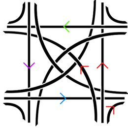
Here is my version of a stack interchange — a system of two highways intersecting such that cars coming from any direction can either go straight, turn right onto the intersecting highway, or turn left in the opposite direction of the intersecting highway (I didn’t allow U-turns so as not to complicate things too much).

My highway interchange: the red arrows show the paths that drivers going in a particular direction could take.  Note that at most two lanes intersect at a point which makes it conceivable to build the interchange with two levels only; in the di…

My highway interchange: the red arrows show the paths that drivers going in a particular direction could take.  Note that at most two lanes intersect at a point which makes it conceivable to build the interchange with two levels only; in the diagram the broken lane is below the other

And here is a slightly different version that doesn’t suffer from the problem of a center being too dense — if you look very carefully, you’ll see that in the version above, the centers of each of the arcs would meet unless the drop is not uniform.

Addressing the problem of a dense center

Addressing the problem of a dense center

It seems to me that it can be built with two levels only — although something makes me think that it’s not that viable to build (since existing stack interchanges require four or more levels), plus to ensure a practical speed it would either have to have a rather large surface area, or only allow passenger cars driving with reduced speed. Here it is in three dimensions:

My stack interchange in three dimensions

My stack interchange in three dimensions

My stack interchange, zoomed in.  The lane splits into three lanes and each separate lane takes you into one of the three directions

My stack interchange, zoomed in.  The lane splits into three lanes and each separate lane takes you into one of the three directions


You can download my Google SketchUp file here .

A Homebrew Computer Alarm

(Originally published on January 7th, 2010)

I wanted to wake up to NPR. There’s a good alarm application for the Mac called Alarm Clock which allowed me to play an arbitrary iTunes playlist on schedule (with bells and whistles such as gradually increasing the volume), but the free version couldn’t deal with playing audio streams (such as, in my case, wnyc.org).

No problem — I used cron as well as OS X’s built-in wake-on-schedule functionality.

First, in System Preferences > Energy Saver, I set a schedule to wake up the computer on weekdays at 6am. Then I edited the crontab: in Terminal I typed

crontab -e

and typed in the editor

1 6 * * 1-5 osascript /Users/strozek/wnyc.applescript

The above tells OS X to run the command osascript at 6:01am Monday through Friday. The script I pass to osascript is the following script:

set volume 2
tell application “Safari”
activate
open location “http://wnyc.org/flashplayer/player.html#/playStream/fm939″
end tell
delay 20
set volume 2
delay 20
set volume 2.75
delay 20
set volume 3.25
delay 20
set volume 3.75
delay 20
set volume 4.25
delay 20
set volume 5

And voilà! I just need to remember to keep the computer plugged in at night and not close the lid.

Being Blind, For a Weekend

(Originally published on December 9, 2009)

For this past weekend’s miniproject, I decided to block all light from entering my eyes. I wanted to experience the world around me with one fewer sense, even if it was just for a few days. In addition to this, I wanted to see if I can help my eyesight get better. Apparently there has been some success in curing an eye condition that I have (called amblyopia) by blinding oneself for a short period of time. In my case specifically, the connection between my left eye and my brain never fully developed because when I was little, my left eye wasn’t as good as my right, and so i ended up relying heavily on my right eye to see. Blinding yourself fully for about one week, the theory goes, may “reboot” your brain and allow the weak neural connection to re-form. I may be able to see small and temporary improvement after just one weekend.

I went to sleep on Friday night wearing a special mask I made that doesn’t let any light through. I would wake up already not being able to see, which should be a good start of this experiment.

The first couple of hours have been interesting, to say the least. Things in general take much more time to do. Moving around the house is not that difficult, but I haven’t built up a mental model of the house (because I had been relying on my sense of sight all the time) so I would sometimes end up getting lost. It takes a while to feel your way through a point of reference that you recognize; if you don’t even know what room you’re in, seemingly easy solutions like tracing the walls doesn’t help.

Eating food is easier than I thought: I was able to microwave food (after solving a mini-challenge of figuring out where the respective buttons were, since they are contactless), make a sandwich, eat cereal and fruit and drink water.

Listening to TV was intriguing. I had to imagine what was going on simply based on what I was hearing. While most times it was doable, it was actually not effortless, comparable to reading a book. I enjoyed this different way of “watching” TV, but I just couldn’t do it for extended periods of time. It’s curious that losing a sense is a very efficient way of limiting–but not eradicating–one’s TV intake.

I thought I would have problems with typing because while I usually don’t look at the keyboard, I calibrate myself occasionally (and subconsciously) by glancing at where my hands are. I was worried that I would be off by one key often. Fortunately, thanks to the excellent accessibility feature of OS X and a mental model of the keyboard that I quickly established, helped me type as efficiently as when I was able to see. Keeping my palms on the laptop in a fixed location helped immensely.

Overall, I am very impressed by the accessibility feature in OS X. I’ve been able to use my computer for listening to music, reading and composing email, and writing. Apple has done a great job making the computer usable for the blind.

While it’s commonly thought that shutting off one sense makes the others more acute, at least in my case it was somewhat more complicated. I would say that I was able to perceive much more than before if I focused on a particular sense. For example, I would perceive sounds pretty much the same way as before blinding myself, but if I focused on a particular song or, say, noise in the kitchen, I was able to extract much more information from it. I could explore food with much more detail and expression than before; for example, I was able to tell the individual herbs that went into the chicken breading. I think an overall improvement of other senses is probably something that takes some time as your brain learns that it can no longer rely on the sense of sight; in the short term, the improvement of other senses during a focused effort is probably due to decreased information “noise” coming from the eyes.

Being blind also completely reshuffles what is easy and what is hard to do on a daily basis. I can receive phone calls but not make them; I don’t know what T-shirt I’m wearing. I am forced to process information much more slowly which means I can’t, for example, go through many blog posts but I’m enjoying listening to this audiobook because I can more easily create a visual representation of what is happening (the book was the Picture of Dorian Gray). Normally listening to audiobooks is somewhat painful to me — now I believe that it’s due to the “visual noise” effect.

This kind of visual sensory deprivation causes me to form certain images in my imagination, as if I was seeing them. They are usually just patterns that slowly transform into other patterns. I can’t see color yet (with the exception of a tiny blue speck of light I just saw surrounded by nothingness). This experience is uncannily like being in a dream (I also have difficulties distinguishing colors in my dreams).

I have no perception of time (ironically, I caught myself actually wearing a watch all day) or any sense of how dark it is. Even though my friend told me what time it was, I hadn’t internalized that the sun had already set. I had this strange feeling that it’s early afternoon most of the day. Overall, I’d say that time moves much faster than normally.

After the first few hours have passed I moved on from being in awe to wanting to be effective. I quickly began to look for objects around me that helped me quickly orient myself. For example, I used the carpet in my room as a reference area — I know, for example that as I follow the carpet along its perimeter I will be moving around the room and at any instant I will have a good mental image of what’s around me.

I find edges much more important than shapes; edges are something that i can trail; shapes lose their intricacies when all you have is two hands moving in three dimensions somewhat coarsely. Connections between objects and their function become much more important than their form.

Day two.

My morning routine took significantly less time than yesterday. This time I’ve been using my other senses more to orient myself in the space. For example, I’d listen to the ceiling fan and based on my perception of where I was relative to it, I was able to move around the room faster. I think I’m also slowly memorizing some distances, for example the distance in steps between my bed and the bathroom. I’m not doing it consciously but obviously in the absence of visual stimuli I have to find accurate and reliable substitutes.

My dreams were richer, fuller, but I haven’t noticed any difference between how I used to dream before the experiment and now. Writing is tougher: perhaps it’s because I’m a visual thinker and not seeing the body of the text I’ve just written makes it difficult to create structure. Writing when blind, even with my computer speaking every word as I type it, is more like on-the-fly storytelling than story construction. The only difference is that I can take my time — as a result the prose is more expressive, flows more naturally, is easier to listen, but has holes in structure.

I’ve worked out some tricks to help me get through the day. When pouring liquids, I put my finger in the container so I can feel the level of liquid and not let it overflow. Similarly, I’d check with my finger whether I put enough toothpaste on the toothbrush. I pour the shampoo slowly on my hand and try to figure out how much of it I poured based on the cold feeling that shampoo has on the palm of my hand.

I think I fidget much more now, again probably due to sensory deprivation.

The most challenging, but also the most remarkable difference is in how I process information. Without the sense of sight, all processing is linear: I have immediate access to the last few words, or bars (if writing music), and the rest has to be filled by my brain. Instead of focusing on structure, I need to think about flow — one thought transforming into another; one world blending into another. I produce much less, but what I produce is richer because it has to stand on its own, be engaging at all times. It’s stateless.

Making music was a great experience — in fact, I think I will continue to experiment with music when blind. I’d find myself not to cling to the same keys as I always do. Recording music is tricky but other than that I felt much more creative. Perhaps, if you don’t see the white and black keys, you start focusing on what’s behind them rather than on them.

Naturally, I am more aware of what is where now. While previously my brain could be lazy (it didn’t have to compose elaborate models of the room and objects within it, because all it took to know was a quick glance), now the cost of gathering information is relatively high: I have to look around and feel my way around so I remember much more. I know where all the articles of clothing are in my room. I know what’s on the night stand, in order from left to right. I remember where I put things.

Going about my life was fairly easy when everything around me was in my control. But when things changed and I wasn’t aware of them, I found it fairly difficult to adjust. For example when some dishes were rearranged, it took me a long while to re-adjust. After I’d noticed the world is different from my model of it, I would have to rebuild my model.

I found it pretty easy to interact with other people. In fact, the lack of visual “noise” meant that I could engage much more in what the other person was saying. I remember these conversations better now.

I took my blinds off on Monday morning. There was no “epiphany”; I also wasn’t bothered by light. Curiously, my right eye (the good one) exhibited similar problems as my left one has always had. This was temporary, but I think it means that the “reboot” theory might actually work — the brain weakened the connection to my right eye. It hadn’t been weakened enough to eliminate the bias, but it was a good start.

While the moment immediately following the regaining of sight wasn’t spectacular, the following thirty minutes were… surreal, to say the least. I felt a little out of it, as it the world around me had undergone some strange transformation while I was away. Perhaps that’s what (temporarily) regaining depth perception feels like (I have non because of amblyopia).

In all, I felt empowered to do some of the things I was able to do before, and was impressed to be able to get more from some others. However, I wasn’t as productive as normally. True, part of it was the fact that I’ve only been blind for two days — I am sure that people who are actually blind have perfected the routines that took me an hour to do. It’s also not at all certain whether that loss in productivity more than repaid itself in the higher quality of the work I came up with during those two days.

Editorial Note

After I published this, I received a comment from a person named Jeremy, which I wanted to include here:

As a blind person, I am a little upset by your generalizations about the blind experience. all your obstacles could have been overcome with a little bit of creative thinking and some adaptive aids. I manage quite well with a screen reader as you mentioned but my cell phone also speaks as well as my speaking/braille watch. I hope that your realizations are taken with a grain of salt, as you didn’t really get a chance to fully accept the differences and adapt over time.
 

The Zoom Effect

(Originally published on October 19th, 2009)

Before using Squarespace, I built my own front page. As I considered the best way to display series of pictures there, I came up with an interesting way to compress a lot of information onto fairly limited screen real estate. The idea was to have a kind of a slide show composed of small icons that turn larger as you hover over them; clicking on any icon would bring up with full-size image. That way I could fit a lot of small (32×32 pixels) icons of images on the screen, yet offer the users the ability to browse larger versions (67×67 pixels) easily just by moving the mouse around. The idea, of course, was inspired by what OS X does with the Dock (an effect which, sadly, I have disabled on my computer–but due to different use scenarios). Here is the effect in action (roll your mouse over the images):


The design process I went through is an interesting example of discovery (or serendipity, rather) and how taking an analytical approach doesn’t always yield the best results.

The desired effect will be very familiar to you if you’ve used OS X and the Dock. I want to display a series of small thumbnails of images in a row. If you hover over them, the image that your mouse is closest to gets larger, pushing out the other images if necessary. I wanted the effect to be smooth (so as you move your mouse over the row, images get bigger as they approach the mouse pointer, and then get smaller) and resemble something like this:

The Zoom Effect

The Zoom Effect

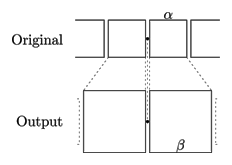
There are three variables that I need to be concerned about: how much to magnify the icons by (in my case, I wanted to go from 32 pixels to a maximum of 67 pixels), how far out the magnification should affect the icons (in the picture above, the icons two to the right of the center icon are no longer magnified), and how quickly the magnification should drop out (how “drastic” the magnification of the center icon should appear). For each of the icons in the row, I need to figure out how much to magnify them (by convention, let’s say that 1 is full magnification and α is the regular, small size) and where to place them horizontally (because they will push out other icons), subject to the constraint that the icons must remained aligned in a row.

An analytical solution was easy to get to, but very quickly spiraled out of control, and here is how. Let’s consider two configurations:

  • When the mouse cursor is exactly in the center of an icon, by symmetry that icon should have the maximum magnification:

Maximum magnification at center of icon

Maximum magnification at center of icon

  • When the mouse cursor is exactly in between two icons, also by symmetry both icons should be of equal size:

Equal magnification in between two icons

Equal magnification in between two icons

 Depending on β, the magnification will drop out quickly (if β is close to α) or slowly (if it’s close to 1).

Since we want the magnification of the icon to be a smooth curve (as the mouse pointer moves across the icons), we simply need to define a continuous function given the three points it goes through: (0, 1) (because atx=0 — i.e. when the mouse cursor is exactly over the icon’s center, we want the magnification to be maximum), (α/2, β) (because when we’re in between two icons — i.e. a distance α/2 away from the center of one — we want the magnification to be β) and (Z, α) (the distance at which all magnification ceases). An exponential curve is the simplest one that we can try:

Magnification as a function of distance from the icon's center

Magnification as a function of distance from the icon's center

 We will then be able to use this curve to determine how much to magnify each icon by. The icons will be sized such that their size given the distance between their center and the mouse pointer can be read off of that magnification curve:

Applying the magnification curve to each icon. Past the point Z all icons retain their original, small size

Applying the magnification curve to each icon. Past the point Z all icons retain their original, small size


First let’s figure out the full form of the magnification curve. The curve must go through the two endpoints we identified, and be exponentially decaying, so it is of the form

\[y = 1 - \left(\frac\right)^P\cdot(1-α)\]

(We can verify that at 0, y=1 and at Zy=α). We need to compute P based on the third point:

\[β = 1 – \left(\frac\right)^P\cdot(1-α) \Rightarrow P = \text\right)\]

The first icon is simple: determine the distance between the mouse pointer and the center of the icon and use the curve above to read off the magnification (it will be something between β and 1). The subsequent icons are a little more tricky, because in order to figure out the magnification you have to know how far its center is from the mouse pointer, but the position of the center is a function of magnification! At this point the easiest thing to do is to solve this numerically, by simply iterating over all possible positions of the center and determining the closest one (since we’re operating in a discrete space with the smallest effective resolution of 1 pixel).

While each step seems fairly straightforward, the end result is a pretty big hairball. Being lazy, I realized that there must be a better solution to this problem.

And then I realized that so long as the illusion of smoothness is preserved, some simplifying assumptions can be made. First of all, the exponential curve I used initially was too complicated and looked too discontinuous at large magnifications (because of a sharp spike near 0); there must have been something else that’s straightforward to compute. The parameters seemed complicated, too — α and Z could be replaced with just one — a measure of how quickly the magnification should decay — without much loss of the effect.

The Normal curve came to mind — with just one parameter (σ) it was much easier to experimentally determine a value that had a pleasing effect (plus, σ is by definition very close to our notion of “how quickly this should decay”). I also got rid of the self-referential problem (determining magnification requires knowing origin, but origin influences magnification) by looking at not the actual distance (how far is the icon from the mouse pointer after all icons have been magnified), but original distance (how far is the icon from the pointer before magnification).

The resulting algorithm is much more elegant — and produces a more visually pleasing effect:

  • For each icon in the original (i.e. before any magnification takes place) series, determine how far its center is from the mouse pointer (I experimented with just using the x-coordinate, but the nice thing about this algorithm is that any smooth function works, and the actual distance produced a nicer effect than just the horizontal distance)

  • Use the Normal curve to determine its magnification. We want the result to be 1 if the distance is 0 (i.e. the icon is directly under the mouse pointer) and α if the distance is infinite (since the Normal curve dies off quickly, the size would go down to α pretty quickly as well), i.e.

\[N = e^\]

\[M = N+α(1-N)\]

  • Place each icon with its magnified size on screen; keep track of how much space each icon took so that subsequent icons can be displayed after it and not on top of it

  • Technically this is enough for magnification. However, this doesn’t produce a smooth effect: since the icons are always pushed out to the right, the “tail” of icons keeps traveling back and forth. We want the entire series of move smoothly, slowly to the left as the mouse moves to the right (go here and watch the icons at the end of the series travel to the left as you move your mouse pointer left to right, across the icons). This is simple to correct, though: keep track of how much space all the icons take (by adding up each size as you go), and then offset all the icons by a fraction of that total space, depending on where the mouse pointer is: suppose the icons originally take d pixels, and expanded they all take D pixels, and the mouse pointer is at position x (between 0–at the beginning of the series–and d), we want to offset all icons by

\[x\cdot\frac\]

See also

Pixel Art

 (Originally published on September 15, 2009)


A small gem today:

I grew up playing computer games on 8- and 16-bit platforms such as ZX Spectrum and Amiga. And between ages 7 and 13 I probably spent more time looking at pixelated characters than I did interacting with real people. Because of this, I hold pixel art dear in my heart.

Below is a piece I made for an article at my job a few years back, and a Photoshop source.  Stay tuned for more pieces.

The factory

The factory